Typography is a cornerstone of UI/UX design, playing a pivotal role in how users perceive, navigate, and engage with digital interfaces. It’s more than just choosing a pretty font—it’s about creating a seamless, intuitive experience that balances aesthetics with functionality. Typography influences readability, mood, and the overall feel of a design. In this blog, we’ll dive deep into the importance of typography in UI/UX, explore best practices, and look at some examples of effective font choices and pairings.
Why Typography Matters in UI/UX Design

Typography is a powerful tool that can make or break a user interface. It's not just about conveying information—it's about communicating hierarchy, structure, and intent. Here are some reasons why typography is so crucial:
1. Improves Readability
The primary function of typography is to ensure the text is legible and easy to read. Users should be able to scan content quickly and efficiently. Good typography helps to guide the user’s eye naturally through the content.
2. Establishes Visual Hierarchy
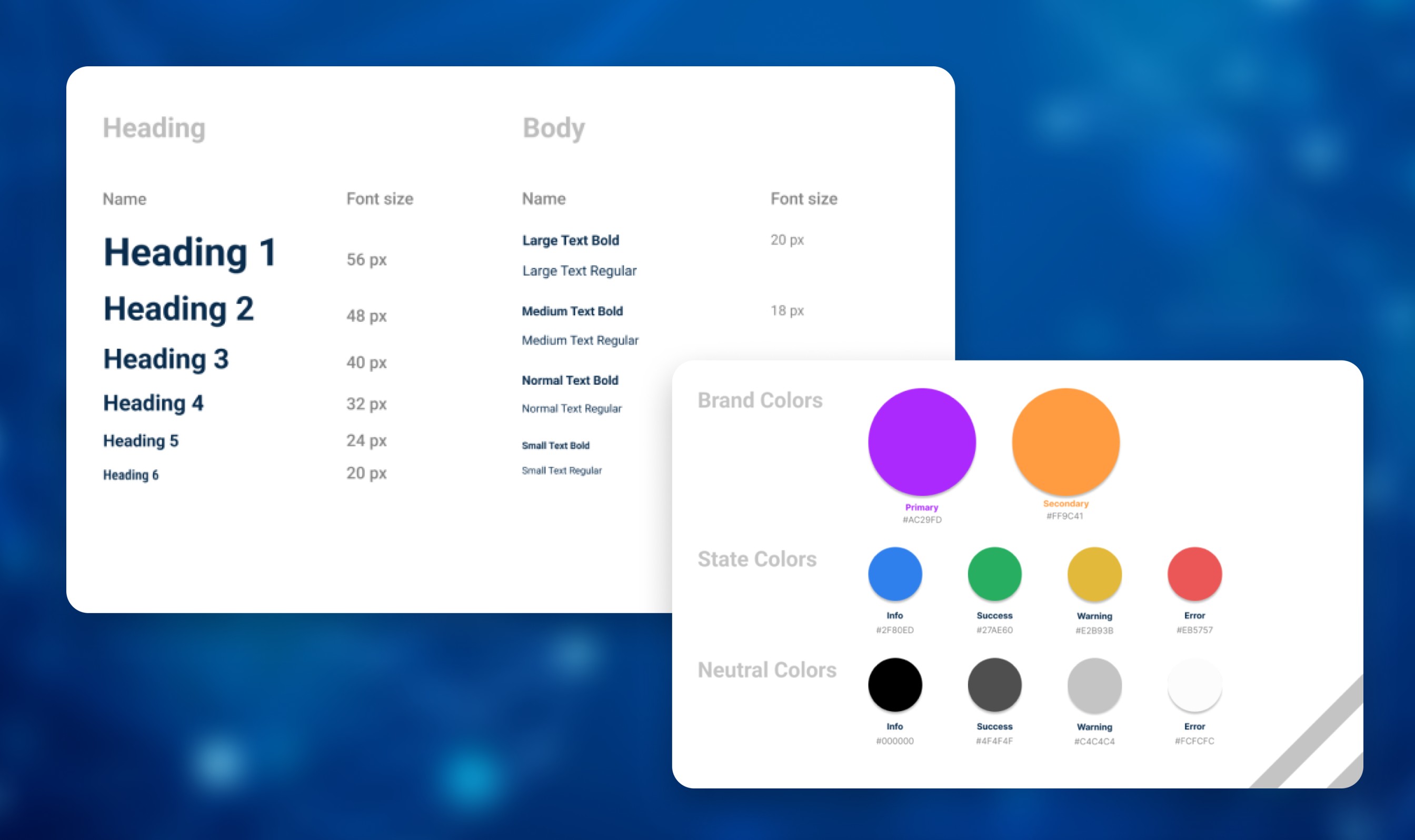
In UI/UX, a well-structured visual hierarchy helps users prioritize information. Typography helps to establish this hierarchy by using different font sizes, weights, and styles to indicate the importance of each section. For example, headings should be distinct and noticeable, while body text should remain neutral and easy to digest.
3. Creates Brand Identity
Typography plays a key role in shaping a brand’s identity. A playful font can communicate a fun, creative brand, while a sleek, modern font can convey professionalism and trustworthiness. The typeface chosen for a UI is part of the brand’s personality and needs to align with its voice.
4. Enhances User Experience
A thoughtfully chosen typeface makes interacting with an interface more enjoyable and less tiring. Typography affects emotion, tone, and the perceived ease of using an interface, all contributing to a better user experience.
5. Affects Accessibility
Accessibility is a major concern in modern design. Ensuring that your typography is accessible means considering factors such as contrast, line spacing, and the font’s overall clarity. The easier it is for all users, including those with disabilities, to read and navigate, the more inclusive your design will be.
Key Elements of Typography in UI/UX

To create effective typography, designers must consider several essential elements. Here’s a breakdown of the most important factors:
1. Font Choice
The typeface you choose should align with the tone of the interface. For example, serif fonts like Georgia or Times New Roman give a traditional, formal feel, while sans-serif fonts like Helvetica, Roboto, or Open Sans convey a clean, modern aesthetic.
2. Font Size
Selecting the right font size is critical for readability. Typically, body text should be between 16px and 18px for optimal readability, while headings can range anywhere from 24px to 48px, depending on their importance.
3. Font Weight
Font weight (boldness) helps establish hierarchy. Heavier fonts draw attention to important elements like titles or calls to action, while lighter fonts are suitable for less critical information.
4. Line Height & Letter Spacing
Line height refers to the space between lines of text. The ideal line height should be around 1.5 times the font size to ensure the text doesn’t feel cramped. Letter spacing, or tracking, can also improve readability by providing more breathing room between characters.
5. Color and Contrast
Your text should always be readable against its background. Contrast is key to ensuring legibility, especially in low-light environments or for users with visual impairments. A high-contrast ratio between text and background enhances readability and accessibility.
6. Alignment
Text alignment impacts the visual flow of a page. Left-aligned text is typically the easiest to read, as it mimics the way people naturally read in left-to-right languages. Centered or justified text can work in certain contexts but should be used sparingly.
Font Pairing in UI/UX

Font pairing is the practice of selecting two or more fonts that complement each other, adding variety to your design without sacrificing cohesion. Good font pairings create contrast while maintaining harmony. Here are some tried-and-true font pairings that work beautifully in UI/UX:
1. Roboto & Roboto Slab
- This is a popular pairing that combines a modern sans-serif font (Roboto) with a more formal serif font (Roboto Slab). It works well for tech and professional websites, offering clarity and structure.
- Example Use: Roboto for body text, Roboto Slab for headings.
2. Montserrat & Lora
- Montserrat is a geometric sans-serif font that exudes modernity and sophistication. When paired with Lora, a serif font with a more traditional feel, the result is a balanced and versatile design that works across a range of interfaces.
- Example Use: Montserrat for headers, Lora for paragraphs.
3. Playfair Display & Source Sans Pro
- Playfair Display is an elegant serif font, while Source Sans Pro is a highly legible sans-serif font. This combination strikes a perfect balance between elegance and simplicity.
- Example Use: Playfair Display for large titles and Source Sans Pro for body text.
4. Poppins & Open Sans
- Both Poppins and Open Sans are clean, sans-serif fonts, but their slight differences in style allow them to pair beautifully. Poppins has a bit more personality, while Open Sans is highly readable.
- Example Use: Poppins for headlines, Open Sans for body text and buttons.
Best Practices for Typography in UI/UX

Now that we’ve covered the basics of typography and font pairing, here are some best practices to keep in mind
1. Limit Your Fonts
A common mistake is to use too many fonts in one design. Stick to one, two or three typefaces to maintain consistency and prevent clutter. If you want more variety, use different weights, styles, or sizes within the same font family.
2. Prioritize Readability
Fancy fonts might look appealing, but they can quickly become a problem if they hinder readability. Always prioritize legibility, especially for body text.
3. Use Responsive Typography
Your typography should adapt to different screen sizes. Implementing fluid typography that adjusts according to screen size ensures that your design is both functional and aesthetically pleasing on all devices.
4. Consider Cultural Differences
If your design is for a global audience, consider the cultural implications of your font choices. Some fonts that work well in Western cultures may not resonate as well in others. Ensure your typography is suitable for the languages and cultural norms of your target audience.
5. Test for Accessibility
Always test your typography to ensure it meets accessibility standards. Use tools like contrast checkers to verify that your text is legible for people with visual impairments.
Conclusion
Typography in UI/UX is a blend of art and science. By thoughtfully selecting and pairing fonts, considering readability, and focusing on accessibility, designers can create interfaces that are not only visually appealing but also easy to navigate. Typography shapes how users interact with your product, guiding them through your content and enhancing their overall experience.
In summary, effective typography isn’t just about picking the right fonts—it’s about making the user feel comfortable, engaged, and empowered as they interact with your design.
FAQ's
1. Why is typography important in UI/UX design?
Typography guides users, enhances readability, and evokes emotion, helping to create a visually appealing and accessible interface that reinforces the brand.
2. How does typography affect user experience?
Good typography improves readability and accessibility, making navigation intuitive and the content more engaging, ultimately contributing to a seamless user journey.
3. What font types work best in UI/UX design?
Sans-serif fonts are widely favored for their clean and modern look, providing better legibility, especially on screens.
4. How does font size impact the user experience?
Appropriate font sizes ensure readability across devices, allowing users to consume content comfortably without straining, improving engagement and retention.
5. What’s the role of hierarchy in typography?
Hierarchical typography structures information visually, guiding users through content by emphasizing key sections, making the interface intuitive and easy to scan.


